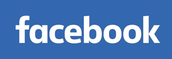
Facebook has a new logo. Well, it’s not so much a new logo but more of a gentle tweak to the original. You have to look closely to spot the differences. The new blue wordmark keeps the favicon (that’s the “f” icon you see most often), changes up the “a” and features a rounder, slimmer custom typeface that’s easier to read on small screens. It is, unfortunately, a bit plain.
Turns out, that was the idea. To read the rest of the article: http://www.wired.com/2015/07/facebooks-vanilla-new-logo-business-not-design/?ref=webdesignernews.com

